The Hard Parts
I've spent a lot of time this weekend on my personal project, and it's really coming together. In other projects I've done on my own, I've always used component libraries for styling. I was never very confident in my CSS skills, and I thought I would never be able to get the project to look like I wanted it to on my own. I'm still no master of CSS, but I'm proficient now. I'm using Flexbox everywhere in this project, except for a few situations where I used absolute positioning. I try to avoid absolute positioning whenever I can, because it basically takes that element out of the flow of the page and can cause issues down the road. However, there are some instances where it's kind of necessary. I just built out a drawer for the filters that opens up when a button is clicked, and I want that drawer to overlap the hero card list on the left. If I were to try and do this with flexbox, the list would get squished up on the right and the filter drawer wouldn't actually overlap it. That is an option for the UI, but I don't like the way it looks when you do that. I would rather have it show up on top of the list. It only covers about 30% of the width of the screen, and I think it's the best option, UI-wise.
Strangely, I've ended up using quite a few things that I've already built in our work project. For example, I built out a filters drawer exactly like this for the representative's leads. I'm styling it a bit differently, but the overall style is almost exactly the same. Otherwise, the way I'm styling things is pretty different. I really like color gradients and I'm using them everywhere in this project. I may have gone a little overboard, but I figured I might as well go for it and achieve the full gradient look. Almost every time I step away from the project and come back to it, I end up changing the color gradients to some other colors, but I think I'm getting closer to how I want it to look. I suspect it will still change a few more times before I finish up. Overall, I really like the way it looks. Functionally, I think I'm managing state in a really efficient way. There are a few things I may end up moving to another context, but for now they serve the purpose they need to. For example, I have a data reducer as well as a screen reducer that are managed individually by 2 different contexts. Right now, I have the filter drawer toggle being managed within the data reducer. That actually doesn't make much sense to have it there, but I'm thinking I'm probably going to have a completely separate reducer just for the filters.
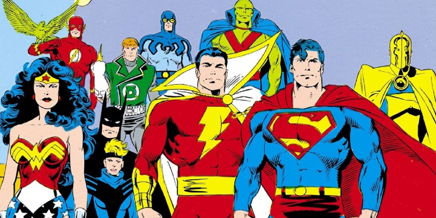
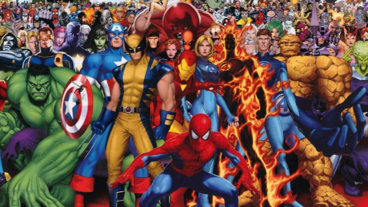
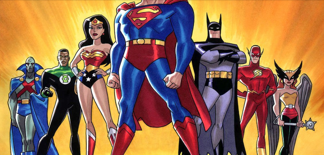
My goal for the weekend was to fix the individual hero page's style and to get going on the filters. I've achieved both of these goals, but the filters drawer is going to be really complicated. I basically want to be able to filter the list of heroes by different parameters. For example, you should be able to check a box and only see heroes, with no villains, or vice versa. I think I will have a select input for the different publishers, or maybe more checkboxes, so you could show just Marvel heroes or just DC heroes. There are other categories I would like to mess around with as well, like only showing X-Men or other groups of heroes, but to extract this data is going to be a little more difficult. The groups are held in an affiliations key on the data object, but it's represented as a string with the group affiliations separated by a comma. In essence, I'm going to have to take this value, split it on the comma, and then filter through that list to find the group affiliation matching the filter. This could be a costly computation, but it would open up some cool filter options. You could find only the Avengers, or X-Men, like I said, or Justice League. I think this would be a really cool option for the filters, but I'll have to see how expensive it is to compute.
Until tomorrow!


