Cracking the System
On Friday at work, or rather at home doing my job, I came to a point where I couldn't work on my primary project anymore. There are 2 of us working on the project, and to that point I had done the majority of the work on the front end. I created all of the steps and pages for the appointment setting process, set up the reducer and context to handle this, validated all of the inputs, and had it all set up and ready to go. But, the styling was pretty awful, and I really hadn't put much effort into that side of things. To be completely honest, I don't feel completely confident in my skills with CSS and making a fully responsive website. I can do it, but I don't think it would look half as good as my cohort would do. This is a big reason why I've decided to push my studies into the CSS world. As I stated yesterday, I've taken multiple courses either focused on CSS or that had large sections on CSS, but I never went that deep with it. This course is 28 hours long, and it goes right into the advanced topics. Oftentimes, I'll take a course that starts at the very beginning of a topic and works its way up to more advanced topics. If I've already studied that topic, this can mean a lot of time is spent in review, without learning new topics. I started the course last night, and I already have an idea I want to apply to both of the projects at work that I'm in the process of building.

Since my neighbor has the main project right now, though, I can't really work on it. For a while, we were working on separate branches. On Friday, we merged those into the master branch and had to fix a lot of overlap. Instead of both of us going off on different tangents, we decided he would take the reins of the project for a while. He had a bunch of styling he wanted to do for it, including making it fully responsive. This project will have a pretty distinct look when it's in mobile size, and he's done an excellent job with it. While he had the project, he stumbled upon a library that uses hooks for validation of forms. Since I've started working here, it seems that almost half of my time has been spent on validation, and I've gone from being a complete novice on the subject to being pretty advanced. I typically use a combination of useState to set up an error and context to manage the state of the information coming back, throwing an error when the information doesn't match the pattern needed. I've been able to find all kinds of validation functions and packages that work specifically with phone numbers or emails, or more recently, even with routing numbers. This package, however, does all of the grunt work and handles the validation in a matter of a couple lines. The code looks very clean, and works much better than the way we were handling it. I haven't really gotten into the project to inspect how it works yet, but I'm excited to learn this new package, and I think it will be very useful. We have a deadline for this project on Wednesday, and we're going to meet with a supervisor tomorrow to discuss the specifics.

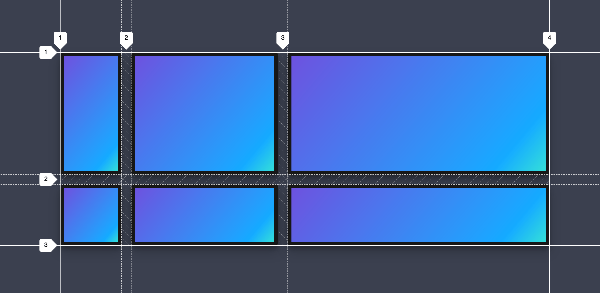
So, while he's been busy with the finishing touches on this project, I've been working on another project. This one is part of the original project I spent pretty much the first 3 weeks of my career working on in early March. In that project, I built out a way for customers to buy a plan without having to go through the quote process, so their representative could walk them through it directly. This has been used multiple times and has already produced quite a few sales. The customer, though, always has to pay with a credit card. Most of our customers are a little older, though, and some of them don't have a credit card or don't want to use it. I'm building out a way for them to pay directly with their bank account. Now, the logic to handle this on the front end was fairly easy to hook up, given the way we have the project structured. Adding those steps in for them to choose a payment process and then input their information: no problem. The difficult part was that they wanted this process to be similar to the way the credit card process worked, where the customer would type in their credit card number and it shows up on a little image of a credit card. They wanted the same thing but with an image of a check. I struggled with building this check all day Friday, but today I was able to get it going, and it looks awesome. It looks just like a check, and I used CSS Grid to do it. I'm pretty proud of the way it turned out, and I still have a little work to go on it, but I can't wait to show it off.
Until tomorrow!
