This.help
Last night, I fell asleep to the sweet sound of Kyle Simpson lighting my brain on fire with JavaScript knowledge. I woke up shortly thereafter in a cold sweat and my mind racing with this sorcery we call JavaScript. I've consumed countless hours of content concerning this twisted language, and I'm still struggling. The course I was taking was just an introductory course, but I was still expanding my knowledge base by the second. There are so many twists and turns to JavaScript, it literally feels like going through a battle every time I get into another course. That said, Kyle Simpson's "Getting Started with JavaScript" was fantastic. His teaching style has been my favorite so far out of every one I've taken so far. He had some great exercises that were actually attainable, instead of being so difficult they make you feel like sticking to HTML and CSS. This course covered the basics from the types to prototypes and quite a bit in between, all in less than 3 hours. He didn't spend much time on any one topic, but I'm sure that's coming up in my curriculum.
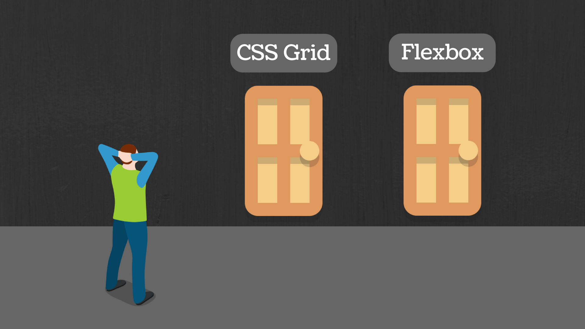
I finished up this course this afternoon and moved on to Jen Kramer's "CSS Grids and Flexbox for Responsive Web Design," a welcome reprieve from JavaScript. I thought coming into this course that it would be a nice vacation of review, but so far, it's been anything but. The course starts off with a short section on floats which were the only way to create a responsive design before flexbox. I really knew nothing about floats and learned quite a bit in a hurry. Of course, this style of creating a responsive design is completely useless at this point in time, but it's still important to understand how we've arrived at our current state. Flexbox has been around since 2009 and is used prevalently but is now being phased out by the superior style of responsive design: grid. Flexbox is used by Bootstrap, the most popular CSS framework out there, as well as other less popular frameworks and is definitely important to understand. It has some strange quirks, but it's doable. I haven't gotten to the grid section yet, but I'm looking forward to it. Grid is not compatible with all browsers yet, but it's definitely moving towards that, and within the next few years, it will likely replace flexbox for responsive design completely.
One of the assignments for this course was to play some flexbox games, namely Flexbox Froggy and Flexbox Defense. I spent way too long playing these games; they turned out to be quite fun. At the end of the day, this may have been the best possible way to learn flexbox. It's always fun to create an actual website, but to move frogs around on a lake and get them onto their respective lily pads was way more fun. Flexbox Defense has you set up gun towers to shoot bombs before they get to their end path, and what could be more fun than that? While at the time it felt as though I was losing time, looking back I learned how to use these properties quickly and actually understand the relationship between them a lot better than I did. I still have a long way to go in this course, but I'm relishing every minute of the break I'm getting from JavaScript!
Until tomorrow!

